
A behind-the-scenes look at: “La Niña de los Fósforos (The Little Match Girl)”
Back in late June I finally published the short-film “La Niña de los Fósforos (The Little Match Girl)” right here on this very website.
And if you've somehow stumbled over here without having seen that first, of course, here's a link:
During the development of this I was putting together a lovely behind-the-scenes video that was intended to release alongside it.
Unfortunately, much like the film itself, this video was subject to massive project bloat and I kept adding newer and newer things to it. On top of this while editing for La Niña de los Fósforos I realised that I didn't have nearly enough practice using After Effects and, well, this seemed like the perfect project to try and learn some new tricks.
Which why I am now finally proud to present: "THE MAKING OF: La Niña de los Fósforos (The Little Match Girl)"
But of course, there's only so much that can be said in a 12-minute long video and with 200 hours invested into my project there were of course some details that I glossed over. So, to make up for that I'll be giving an exclusive breakdown of several of the effects and techniques used to master the aesthetic of La Niña de los Fósforos.
The Making-of the Animation
The Set
To properly capture the visual aesthetic of La Niña de los Fósforos many elements had to be built specifically for the production of this project.
The Glass
To properly animate the film using entirely paint-on-glass I required three panes of glass. These were commissioned at my university's glass workshop and made to a unique and particular specification. Each of the three panes was cut to 250mm by 145mm giving me a 16:9 workspace of 240mm by 135mm along with a 5mm bleed around each of the sides. At the time of commissioning the glass I believed that this would be adequate for my work, and while it was indeed functional it was not optimal. Due to the necessity to create spaces to prevent the panes of glass from pressing against each other and thereby smudging the paint small foamboard cutouts had to be inserted at each of the four corners, however fitting this into a 5mm space was not at all practical or secure, meaning that much of the glass went to waste in order to crop these spacers out while maintaining a proper aspect ratio.
The Camera
Capturing the film also proved to be rather difficult, early tests had the reflection of the camera, and the ceiling far more apparent than they were in the final film. In order to combat this issue a small stand was constructed using adhesive tack, leftover clay, and black foamboard. These were propped up at an angle to prevent the glass from pointing straight up towards the white ceiling and also made animation far more comfortable due to the improved angle.

The rather improvised setup I was forced to rely on to minimise the unfortunate set that I had been provided.
Unfortunately due to the nature of the set being white, reflections were inevitable and are still clearly visible in certain shots. In the future I would wish to construct a newer set for myself, or perhaps find ways to cover up and hide the brighter areas of the studio from the glass so they could not reflect so easily.
The Concept and Planning
The Four Elements, and Early Ideas
As this was made as a part of an assignment the initial brief and concept was given to me. This concept was simply to create an animation based around one of the four elements. While the final product was the only one I developed I initially considered many other concepts inspired by the rain. One early idea that was not developed any further than a small animation to test how I could animate rain would have involved a lonely man being followed by a raincloud until he returned home to his family and their warmth cast the cloud away.

An early test for an abandoned concept involving water and rain.
Paint-on-Glass
Paint on glass was chosen as a medium specifically for its unique liquid texture. At the time of initial concepts it was my idea to explore the animation of the four elements through paint-on-glass with supplementary animation being made digitally to speed up production. Eventually, wanting to explore my use of the medium further, this was changed and the entire animation was painted instead.
This allowed me to explore basic ideas of impermenance during my production. Having typically worked in traditional animation using paper which can be stored, or digital animation where files are saved, needing to discard every frame and background I worked on for each scene was a very strange experience. In some ways the impermenance made me far less hesitant and allowed me to draw with confidence as if a mistake were to be made, it could easily be wiped away, and once something was completed, it couldn't ever be revisited.
With the themes of death and remembering things of the past so strong in The Little Match Girl, it only felt fitting that the animation be made in a medium that properly reflected these concepts and ideas.
The Little Match Girl
Having a fondness for matches since childhood and being vaguely aware of this children's story I decided to visit it again during my experimentation after having developed a few test animations to see how well I would be able to animate a match burning away. The story hooked me almost instantly, with a rather simple plot that I originally intended to simplify even further, right down to its most basic elements, before animating. The connection between my fondness and interest in the matches and a story that would let me explore this seemed almost perfect, and the more I developed this work the more involved the original story by Hans Christian Andersen became.
The Use of Colour
As a colourblind artist I had always avoided paints in the past due to the difficult I had in properly mixing colours. While digitally I am able to more easily overcome this with an understanding of colour theory and HSV sliders, and through the use of certain materials such as markers and a more unique method of utilising watercolour pencils that differs to the most common practices I am typically able to create colourful artwork without allowing my mild deuternopia to affect me.
Paints however have always been a far different beast as I am often unable to ascertain which paints are the particular shades I am looking for due to the many similar colours often provided, and mixing them becomes even more difficult as I am unable to properly rely on my eyes to judge which colours are needed to create the desired outcome.
This led me to using rather limited colours throughout the animation, sticking to primarily only three mixtures of red, blue and a peachy-skin tone. Backgrounds were often left dark and black, with small hints of blue to add an element of coldness to them to contrast against the much warmer red used for my main character.
Background characters were all rendered in plain white to both add a faceless element to them, and distinguish them as being unimportant in comparison to the titual Little Match Girl, and the grandmother was drawn in her own unique way, being drawn as only a white outline to indicate that she was not appearing phsycially as the townsfolk or The Little Match girl were.
Using a more limited colour scheme also allowed me to create the animation much faster than if I were to have needed to mix excessive numbers of colours and add them each to my palette for every shot I drew, which greatly benefitted by tight production timeline.
The Fire
A key motif in the film is the use of fire, and making this fire look right was no easy task.
Realism vs. Aesthetic
Real matches have a very smooth flame, with little flickering and a oval-like shape. However in animation this can look quite plain as I quickly realised which is why the flame in my animation was stylised in such a way to appear less realistic but far more dynamic in its motion, as can be seen in the comparison below.
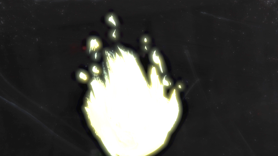
A bright white flame as seen in La Niña de los Fósforos.

A sample of a test-shot recorded during pre-production of La Niña de los Fósforos
By using exaggeration in this way I was able to create a more visually pleasing and instantly recognisable flame as opposed to the more mundane and still reality of burning matches.
Compositing and Special Effects
In the short film, La Niña de los Fósforos, the main recurring flame that is used again and again throughout the animation has two different and distinct lookos, as can be seen in the comparison below.
The first is a much more realistic appearance for the fire, while the latter is much more subdued and yellow in comparison to how a flame should look. The reason behind this though, was quite simple. In shots where the appearance of the Grandmother neede to be clearer a darker appearance for the flame was needed so as not to entirely obscure her while the brighter flame could be used in all other shots.
Different blending styles along with different blurs were used to properly capture capture the brightness and glow of the flame.

A more yellowish flame that was used at various points during the La Niña de los Fósforos short film.
The Movement of the Flame
Using onion-skins in Dragonframe I was easily able to create a looping animation for my flame by first creating two keyframes and adding various inbetweens before returning the animation to its exact starting position. Certain animation principles such as squash and stretch were exaggerated in the flame, as it widens when it shrinks vertically adding a more dynamic and fluid range of motion to its flicker, thus creating a more engaging visual to look at.
The unique movement and feel of the flame was created via the use of a duplicate flame, with its timing offset by a small amount. This duplicated flame was then blurred using filters in After Effects and made slightly translucent. This gave the flame a slow and almost ghostly trail behind it as it moved helping to sell the silky movements of real fire.